Recently, a client reached out to us about publishing a recipe book for them.
The scope:
- Layout 60 to 80 pages
- Print 100 copies
- Get ISBN numbers
Sounded easy.
As always, after asking about what the work involved, I asked them what they had budgeted out.
They said they didn’t have a clear budget. But they then told me that they had other bids that had come from the printers they had reached out to.
They told me one printer offered to print 100 copies at $8.20 per copy, and to layout the book for them for $200. I stopped, mid sentence.
I did a quick calculation in my head. That was $2.50 per page.
How could one design pages at $2.50 per page?
Was that truly possible? Were we just being too purist about our business stance?
I told them quickly that we would be possibly at around $6500 for the total work.
She paused.
So expensive?
I said,
yes unfortunately that’s the price.
When we followed up to ask if she could send some samples of what they had done, so we could gauge how much work we needed to put in, she said,
we are not comfortable to share what has been done.
That sales call eventually stopped at the enquiry process.
Why? Because of one simple problem.
There was a disconnect between what we sold as a publishing agency, and what they were willing to pay for in a printing company.
Which begs the question:
What’s the point of having a professional design agency doing your publication design?
Allkin had a problem. They had a tight budget and not much to spare for this research they had done on anticipatory grief. But it was going to be launched with great fanfare at their inaugural Mental Health celebrations, and they needed it to look professional.
They had tried everything. They had even done it on Canva, and spent hours trying to make it beautiful. But even they, as non-professionals, knew that it wouldn’t cut it.
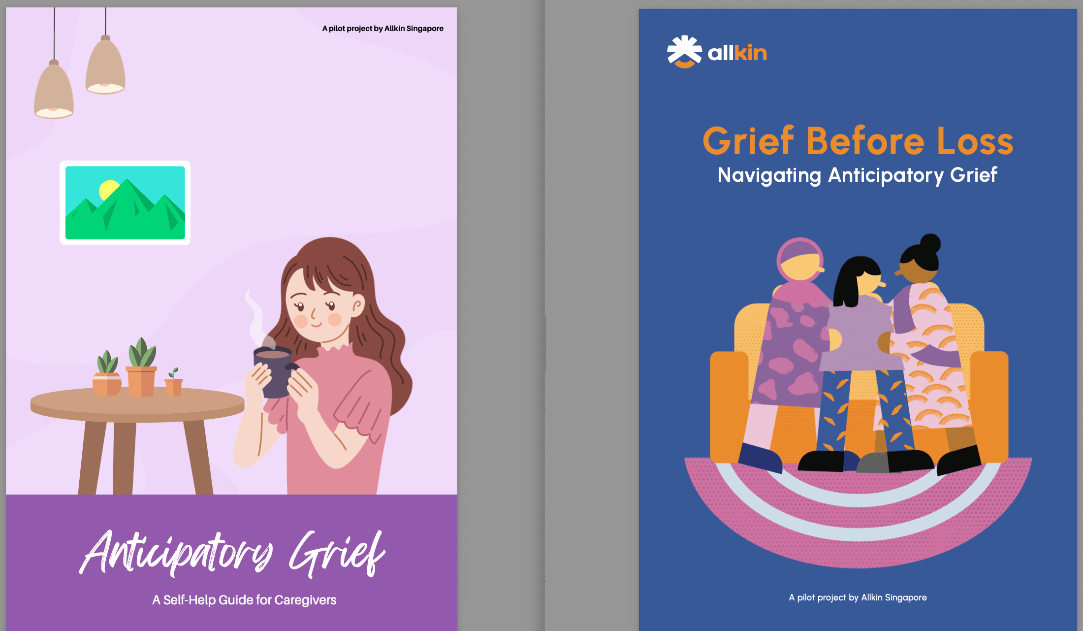
They had just introduced a new brand guide, and none of what they were finding on Canva was fitting their brand guide. They needed custom illustrations, and there was nothing they could do but find an agency.
When we bid for the project on Tenderboard, we placed a bid that would lose us money. We knew that the sums didn’t add up, but we decided to do that so that we could get a marquee client like Allkin, who was one of the biggest Social Service Agencies in Singapore.
We eventually won the work.
An agency that can write in an emotionally resonant way
Now it was time to work. First off, we had to rework the manuscript.
Why the manuscript? Because the writing structures the eventual work. Many agencies would dive straight into the work without assessing the manuscript, but we’d be one of the first to say that’s a horribly foolish process.
Because without a good manuscript, you would have a report that just sounds boring. Dull. And something people would toss.
Sorry.
We wanted to be kinder – but as publishers, we’ve seen our fair share of books that simply don’t meet the cut. As one editor once told us,
There are enough books in the world. You don’t have to make another one that isn’t even worthy of the paper it’s printed on.
Whilst the manuscript was great, it lacked a controlling idea that would make it coherent and cogent. Like a smooth piece of butter, on your kaya toast. The manuscript, when we first read it, felt like dry kaya toast, the likes of which had been left out for 4 hours, and which you were now biting into.
Don’t get me wrong – this is not to disparage the client. But we knew that as social workers and programme executives, writing was not their main job. In fact, they had gone above and beyond their role to make this possible, trying their absolute best to make everything read well.
Below, you can quickly see the difference between the two drafts.
Ours tried to be zippier, and more emotional. We knew that people could probably Google and ChatGPT what anticipatory grief meant, but such AI tools would find it hard to help people feel differently.

We focused on the emotional resonance, so that people would continue reading.
One of the most touching reports we’ve read over the past few years have come from the social service sector.
Design enhances the results
Just look at Teo You Yenn and Kok Hoe’s great research on the Minimum Income Standards published in 2023. It spurred a furore of responses, particularly from the Government. But what was also notable was also how they put out this report in a simple, yet effective manner. As you’d know, funding is often limited in the research space and for them to have come to put this together in the limited time they had was definitely no mean feat.
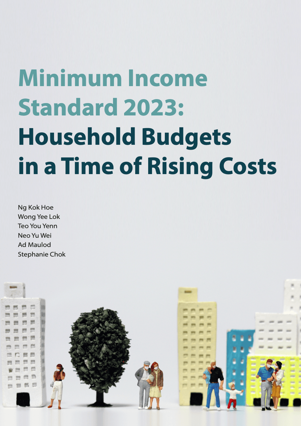
Their particular designer made use of a simple color palette to highlight the stark differences between the haves, and have-nots, and this amplified the significance of their research. As a former social worker myself, I also knew that there was a stark contrast in the low-income families that often saw me at the Family Service Centre.
This report highlighted it all.
The report looks media worthy
Perhaps the most important thing to note is how some design agencies can bring a long-term uplift to the profile of your agency, with a well-designed piece of work.
At the launch of the Grief Booklet that we worked with Allkin on, we had Dr Janil, the Senior Minister of State. Whilst they could have done it on Canva, showing something that had been intimately and professionally designed allowed it to have legs.
Professionally clean layouts
But beyond just better writing, we also focused on layouts.
You might wonder what the point of layouts are. After all, is it that hard deciding where to put something on a page?
But we know ourselves, why we prefer one software interface over another. For example, it’s hard to get Apple users, to love the Android interface, and vice versa. It’s not that one is necessarily superior to the other but simply that they have different layouts that appeal to different tastes and ways of deciding.
For a long time, I loved Google’s products because of how clean and simple they were. My first phone was an Android and I enjoyed just how customisable it was. At the age 17, it felt like freedom. But then I ended up going back to a Blackberry because of how much simpler it felt. The layouts were more focused on functionality, rather than the latest cute thing. As a 17 year old that wanted to be less distracted by my phone, it was the most important thing.
In the same way, when Allkin came to us with what they did with Canva, we could see immediately how the cute vector graphics were appealing. But they didn’t necessarily get the message across in a focused way.
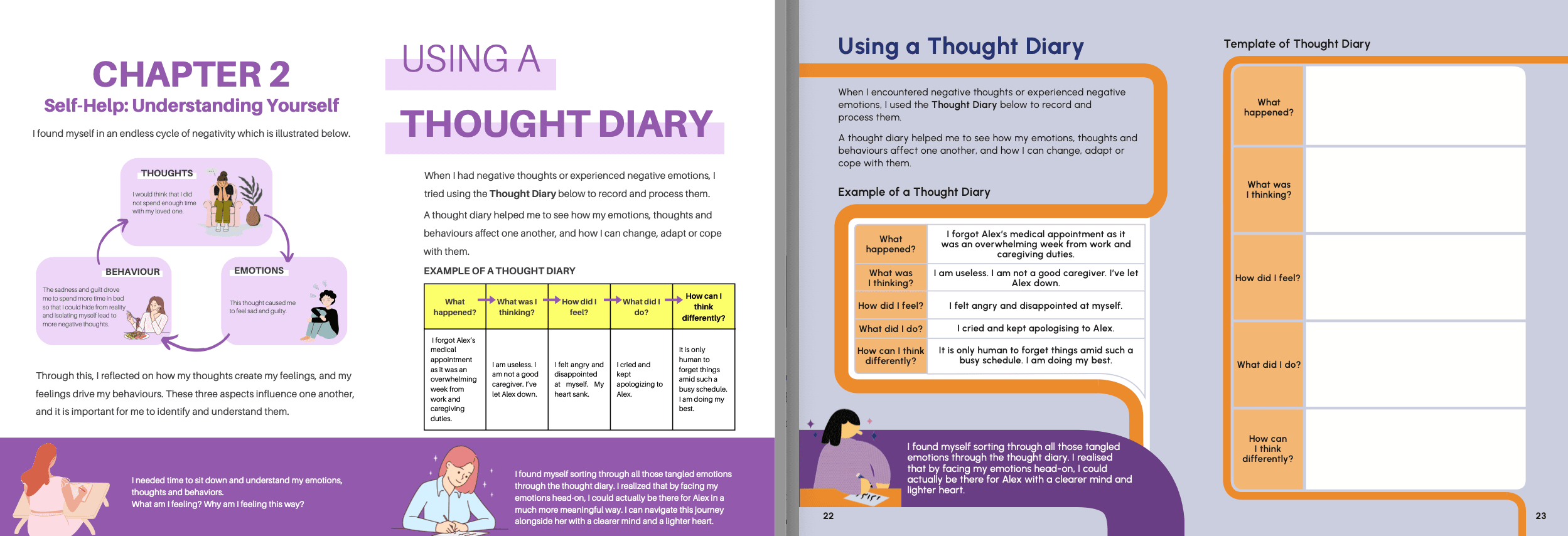
As you can see from here, on the left, it was hard to tell how the graphics contributed to the text.
As professionals, we’ve come to see how it’s usually the professionals that can comfortably murder their darlings. Those who don’t have a design background often focus on how something looks appealing, rather than useful.
We make sure it’s useful.
Agencies that believe less is more
Ultimately, choosing a report design agency that suits you is about an agency that you trust.
I’ll perhaps close off with this story. In August 2025, an author asked us to design her book. She said Partridge had offered to do it for a $1000, and that another freelancer she found on Fiverr had taken her $500 and then disappeared.
Disappeared!
We didn’t quite know how to assuage her worries that we weren’t bunch of Fiverr guys that would disappear.
But we thought we could do our best to help.
At the end of the day, modern technology means that you can do everything on your own. And it might seem a waste of money if you spend $8000 on a layout. What does that $8000 pay for?
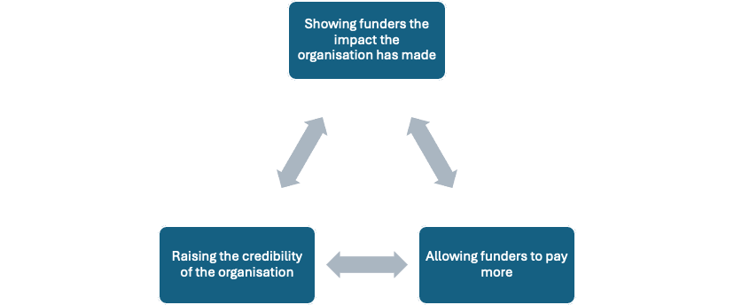
Well, if you can see some of the downstream effects of our work, you would have see that these reports go towards:
This becomes a virtuous circle.
And it’s why you might just find that even that $8000 might be cheap.
